Product Page: 20+ Attractive Designs With Best Tips (2023)
In the world of e-commerce, your product page can make or break your sales. It’s the crucial point where potential customers decide whether or not to make a purchase. Thus, creating product pages that not only look appealing but also provide an easy and enjoyable shopping experience is of paramount importance.
To help you do just that, we’ve compiled a list of 20+ attractive product page designs that embody the latest trends and best practices in online retail for 2023. Along with each example, we’ll share actionable tips to take your product pages to the next level and keep your customers coming back for more.
20+ Outstanding Product Page Design Examples
In this collection, we’ve put together over 20 outstanding product page design examples, each offering a unique blend of creativity, functionality, and user-friendliness. These designs are sure to spark ideas and guide you in creating an engaging shopping experience for your customers.
1. skims.com
The SKIMS product page offers a streamlined and pleasant browsing experience. Upon arriving on the page, visitors are met with a clean and refined design. Notably, the color scheme adapts to match the selected apparel’s color, providing a cohesive visual experience.
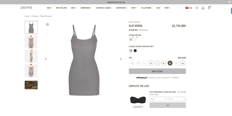
SKIMS is a brand that focuses on providing solutions through its collection of underwear, loungewear, and shapewear. Consistent with this approach, their product page effectively displays a wide range of items. Instead of the usual “Add to Cart” button, SKIMS uses the term “Add to Bag,” which lends a more realistic shopping feel, similar to a brick-and-mortar fashion store.
One unique feature on the page is the “Complete the Look” section, which offers a selection of underwear and shapewear that matches the color of the chosen item. This allows customers to easily put together coordinated outfits.
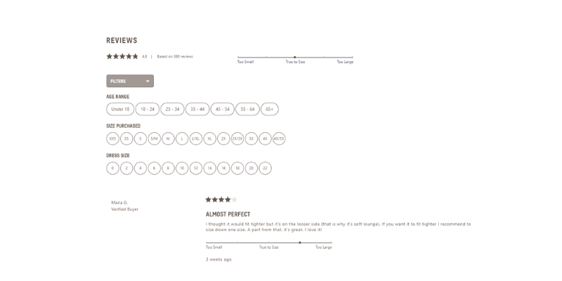
Additionally, the review section is equipped with filters for age range, size purchased, and dress size, making it more straightforward for shoppers to find relevant feedback.
2. Bodybuilding.com
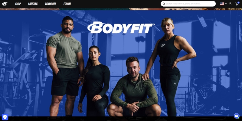
Bodybuilding.com is built on the concept of trust. The site employs a black color scheme with blue and white text and features images of individuals in workout attire. This design is likely intended to appeal to a fitness-focused audience.
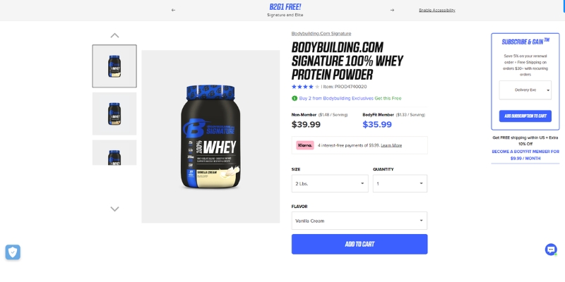
The store’s Signature line offers products that the brand states are transparent, filler-free, and formulated with research-backed ingredients. Each product page includes details such as descriptions, ingredients, usage directions, warnings, intended fitness goals, and information about the brand. This information is likely included to offer customers clarity regarding product contents and uses.
3. ooni.com
Ooni is a company that specializes in designing and manufacturing portable pizza ovens for both home and professional use. Ooni’s website is designed in a way that quickly informs users about their products without overwhelming them with unnecessary content. The visual elements and content are aligned with the brand’s specialty in outdoor cooking and pizza ovens.
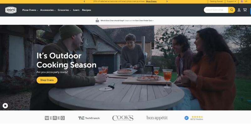
The landing page of Ooni’s website features a family meal using their oven, and the color scheme is predominantly black and orange, giving it a classic and warm appearance. The product page is structured efficiently, with the first block containing a slideshow that showcases the oven from various angles and in real-life settings. This provides potential buyers with an understanding of the oven’s true size and allows them to envision it in use.
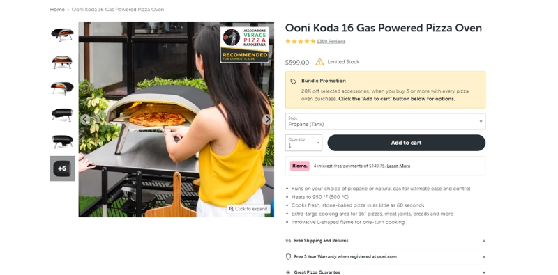
The second block on the product page offers more detailed information about the oven, listing what’s included in the box and outlining the technical features of the product. The page also provides buttons for users to download guides and instructions, a helpful addition for those interested in learning more about using the oven.
4. boomf.com
Boomf is an online store specializing in unique and personalized gifts. Their offerings include Greeting Cards, Exploding Confetti Cards, Mallowpops, Gift Boxes, and Customizable Balloons.
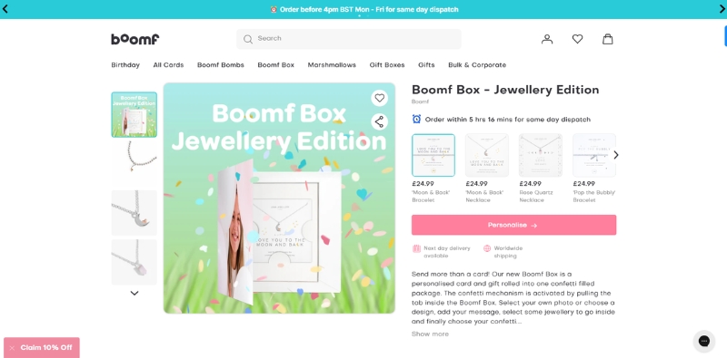
The website has a colorful design, creating a festive atmosphere similar to a birthday party. Product pages are simply designed, featuring a slideshow with videos of the gifts being used in real-life scenarios, allowing potential customers to understand the products better. Additionally, buttons are available for adding items to a wishlist or sharing on social media channels.
There is a button for customers to easily personalize their gift with photos. Also, information about shipping dates is provided, assisting customers in determining whether the shipping times fit their gifting schedule.
5. venusetfleur.com
Venus et Fleur is a luxury floral retailer known for its signature Eternity Rose, a real rose preserved to maintain its beauty and freshness for up to a year or longer without water or sunlight.
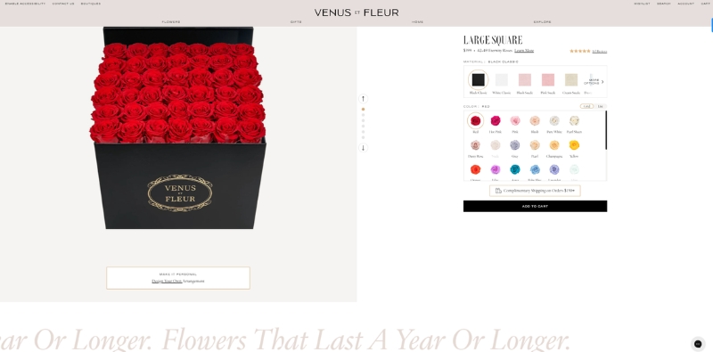
The website employs light and soft colors in its design and flower displays, exuding an elegant and comfortable ambiance. On the product pages, a slide of product images occupies half of the first block, creating a seamless look. Color options are presented as actual flowers, providing a friendly visual cue of how the flower looks in real life.
A prominent tagline follows, emphasizing the main feature of the brand’s flower: Durability. Images of the flowers are thoughtfully placed throughout the product pages, creating a friendly and attractive display.
6. darngoodyarn.com
Darn Good Yarn offers uniquely crafted yarns, fibers, and craft supplies. The brand emphasizes high-quality, eco-friendly products sourced from artisans and manufacturers worldwide, supporting sustainability and fair wages. The store features a simple design with an interesting product review section. The section displays reviews in distinct blocks, making them easy to read.
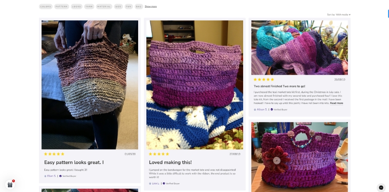
A unique feature of this section is the ability to filter reviews by popular topics such as colors, texture, feel, yarn weight, looks, softness, fibers, and more. This allows potential buyers to find feedback that corresponds to specific aspects they might be interested in. Moreover, customers can opt to view only reviews with the media, providing an opportunity to see the actual products received by previous buyers.
7. chamberlaincoffee.com
Chamberlain Coffee’s website presents a variety of coffee-related products, encompassing coffee beans, brewing equipment, and merchandise. The brand, founded by internet personality Emma Chamberlain, reflects her aesthetic in its clean and uncluttered design.
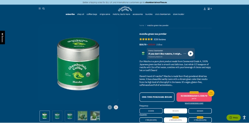
The products page employs a single-color background with product images that have a transparent background. This gives a minimalist yet appealing appearance, with high contrast between the background and the black or white text. The simplicity allows the products themselves to shine, with their photos capturing attention.
One notable feature is the subscription customization option, which is clear and accessible. It provides the opportunity for users to receive discounts, making it easier for potential customers to make a purchasing decision. Another intriguing aspect of the products page is the inclusion of a button to play Chamberlain’s podcast. This multimedia approach to encouraging sales is innovative and likely to resonate well with Chamberlain’s audience.
8. blenderseyewear.com
Blenders Eyewear is an eCommerce site dedicated to providing fashionable yet affordable eyewear products, including sunglasses, prescription glasses, ski goggles, and accessories.
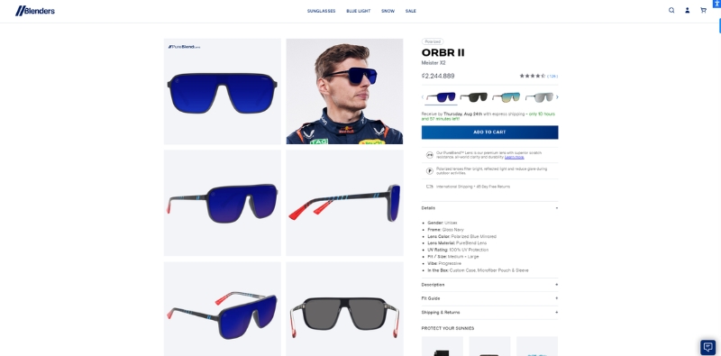
The product page on the Blenders Eyewear website is notable for its comprehensive display of items. Products are shown from multiple angles and are arranged in block form, which allows potential customers to see the design and functionality of each item from various perspectives.
Furthermore, each color variant of glass comes with its own set of photos showcasing the product in real-life scenarios. This approach not only demonstrates the products’ style and versatility but also helps potential buyers to envision how the items would fit into their own lifestyles.
Additionally, the product page features a well-organized and concise presentation of product details and shipping policies under dropdown options. This makes it easy for customers to find and access the information they need without being overwhelmed.
9. thespicehouse.com
The Spice House is a well-known online retailer that focuses on offering high-quality spices, herbs, and seasonings.
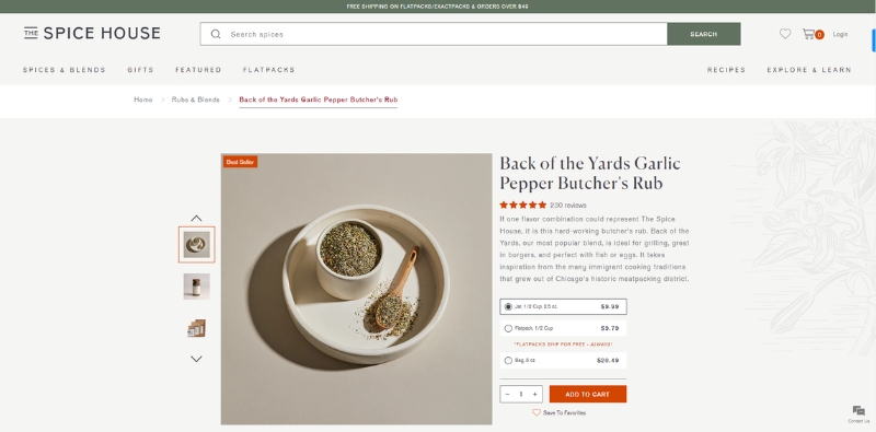
The product page of this store is a testament to its minimalist design. The background features a subtle imprint of herb patterns, which contributes to a simple yet elegant aesthetic. This design choice resonates with the store’s specialty while maintaining a clean and uncluttered look.
The layout of the product page is commendably organized. Rather than overwhelming the viewer with too many details in one block, The Spice House has wisely chosen to display only the essential information in the first block. This includes the product image, price, and a brief description, making it easy for customers to quickly grasp what the product is about. The second block is dedicated to detailing the ingredients, providing the depth of information that discerning customers seek.
10. sunwarrior.com
Sunwarrior, a health and fitness company, specializes in plant-based protein powders, supplements, and superfoods. Their ethos centers on providing clean, eco-friendly, and healthy nutrition products, emphasizing natural and nutrient-dense ingredients without artificial additives.
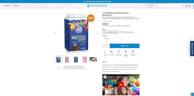
The product page on their website showcases a slideshow of the food’s key features right below the “add to cart” button. Each feature is represented by a logo, quickly conveying the benefits of the products in an easy-to-digest format. This design choice is practical and informative, giving potential customers a quick overview of the product’s main attributes.
The inclusion of promotional videos on the product page is a strategic move to boost conversion. These videos likely provide additional information on the products, their benefits, and usage suggestions. They can engage and persuade potential customers more effectively than static text and images.
Block 2 of the product page prominently features a banner highlighting the health benefits of consuming Sunwarrior’s products. This reinforces the brand’s commitment to supporting physical and mental well-being and resonates with its target audience.
11. calpaktravel.com
CalPak is a travel brand that offers a broad range of luggage, backpacks, and travel accessories designed to meet diverse travel needs. The company is known for its blend of style and functionality in its product offerings.
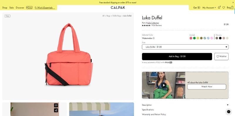
On the product page, CalPak showcases its items in a wide variety of colors, providing individual photo collections for each color variant. This feature allows customers to get a comprehensive view of the products in their preferred colors, helping them make informed decisions. Additionally, the color of related products changes based on the color of the product currently being viewed, creating a cohesive and visually appealing shopping experience.
Another notable aspect of the product page is the inclusion of promotional videos right below the “add to cart” button. These videos serve as effective tools for demonstrating product use and highlighting key features. They provide customers with a more immersive and informative look at the product, showcasing its utility and benefits in real-life situations, which could potentially increase conversion rates.
12. Iliabeauty.com
LIA Beauty, a cosmetics brand, offers clean, ethical, and sustainable makeup products. The product pages on their website exude an elegant aesthetic, aligning with the brand’s image. A standout feature is the customizable subscription plan, allowing customers to choose delivery frequencies from every 1 to 5 months. This flexibility caters to various usage patterns and personal preferences.
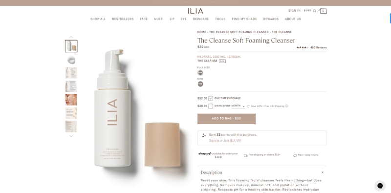
In the review section, customer images are displayed in block format, showcasing real-life product results. This visual testimony adds authenticity to the reviews and helps potential buyers envision the product’s effects.
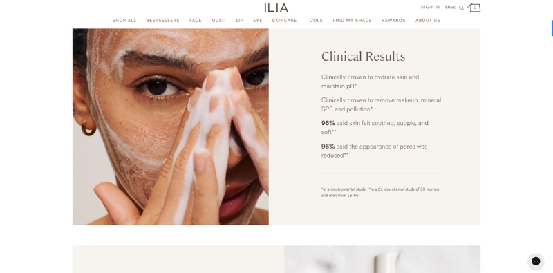
The product pages also display close-up shots of a model’s face being washed with LIA Beauty products, giving customers a clear idea of the product’s application and effectiveness. A detailed FAQ section addresses potential questions and concerns, providing customers with comprehensive information and enhancing their shopping experience.
13. flexsealproducts.com
Flex Seal Products, a reputable brand, provides a diverse selection of sealing, bonding, and coating solutions for home, automotive, and industrial applications.
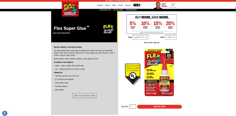
The product pages are organized and easy to navigate. On the right, customers can find the product image with all applicable discounts prominently displayed above the add-to-cart button. This layout makes it straightforward for customers to see the product and any special offers, facilitating quick and easy purchasing decisions.
The navigation bar is neatly organized into sections: Description, Directions, Videos, FAQs, and Reviews. This structured approach allows customers to quickly access the information they need, enhancing the user experience. The inclusion of instructional videos further assists in illustrating the product’s application and benefits.
14. vessi.com
Vessi is a footwear brand known for its waterproof, lightweight, and comfortable sneakers. The product pages on Vessi’s website are user-friendly and well-designed. A convenient button allows customers to switch between men’s and women’s shoe styles, making it easy to find the right fit. Each color variant of the shoes has its own photo collection, giving customers a comprehensive view of the product in their preferred color.
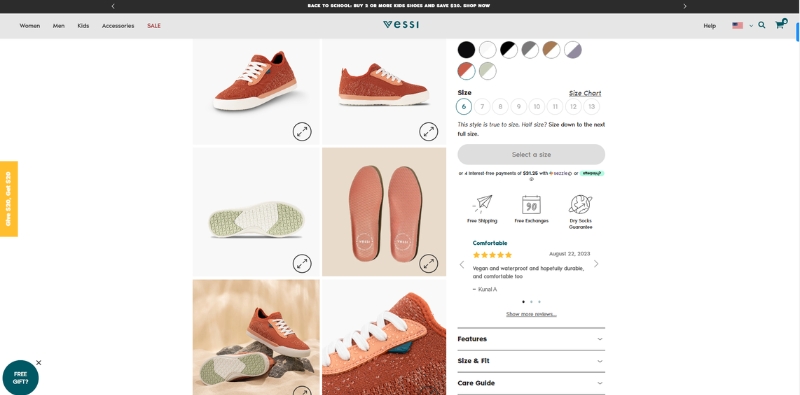
The key features of the sneakers are prominently displayed right after the first block, with simple yet meaningful logos representing each feature. This layout provides customers with a quick and easy way to understand the unique selling points of the sneakers.
15. shopthemint.com
The Mint Julep Boutique is an online women’s fashion store offering a wide range of trendy apparel, accessories, and shoes. The product pages are designed like photo albums, predominantly featuring images of models wearing the products, with minimal text. This visual-centric approach allows customers to see how the items look on a person and helps them envision themselves wearing the products.
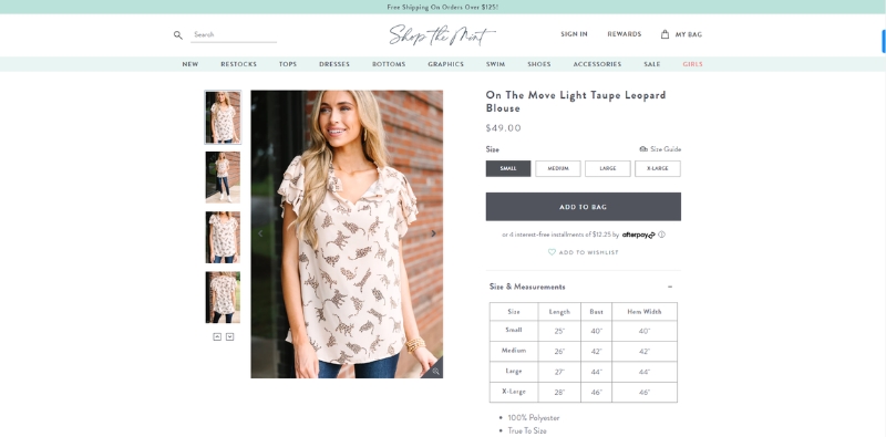
The inclusion of a size table directly in the first section is a practical decision. Customers can easily find their correct size without having to navigate away from the page, streamlining the shopping experience.
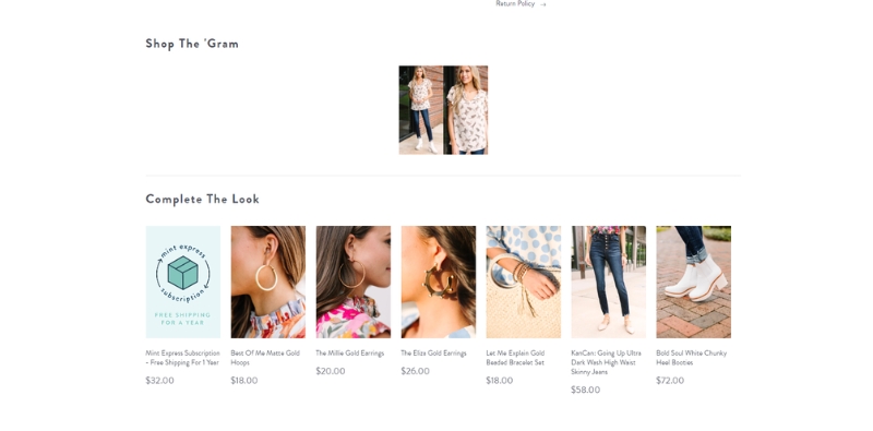
The “Shop The Gram” section on the product page showcases curated sets of clothing and accessories, inviting customers to explore and discover coordinating pieces, allowing customers to put together complete outfits effortlessly.
16. beginningboutique.com
Beginning Boutique is an online fashion retailer based in Australia, providing a broad selection of trendy clothing, accessories, and swimwear for women.
The product pages of the website are designed with simplicity in mind, displaying only necessary information. They showcase two item images simultaneously, potentially making it easier for customers to view different angles of the product without additional navigation. This streamlined design may facilitate a more efficient shopping experience.
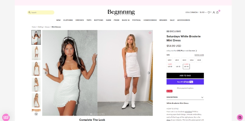
A notable feature of the product pages is the stock notification system. When a size is out of stock, customers can click on the size, and a pop-up tab appears. This allows them to enter their email or phone number, and the store will notify them when the size is available again. This feature can be beneficial for customers who are interested in specific sizes and may improve the overall customer experience by providing an option to receive updates on product availability.
17. draperjames.com
Draper James, founded by actress Reese Witherspoon in 2015, is a Southern-inspired brand offering clothing, accessories, and home decor items that reflect the charm of the modern Southern woman.
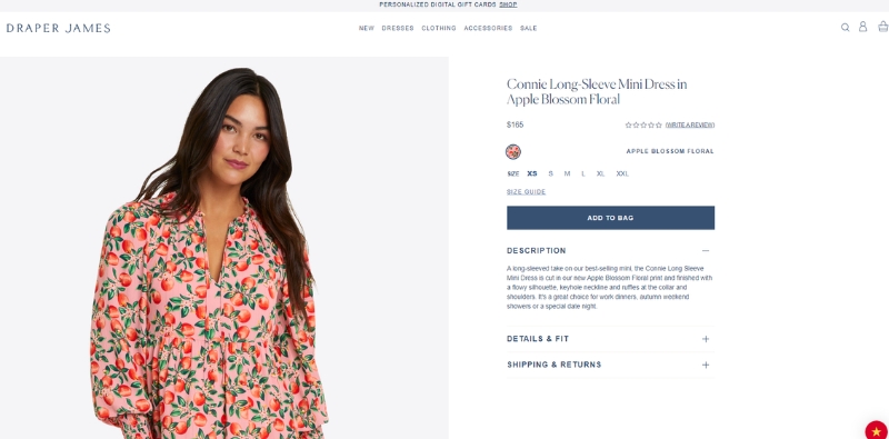
The product pages on the Draper James website are straightforward and clean in design. Images of the products are prominently displayed, taking up half of the first block, leaving no blank space.
The remaining half of the block consists of options for customization, the “add to cart” button, details about the product, and the shipping policy. Notably, this portion of the page remains stationary while scrolling through the images on the left. This static design element may provide a seamless shopping experience for users by keeping relevant purchasing information readily accessible.
18. blendjet.com
BlendJet is an e-commerce platform that offers portable, rechargeable blenders, notably the BlendJet One, designed for convenient on-the-go blending.
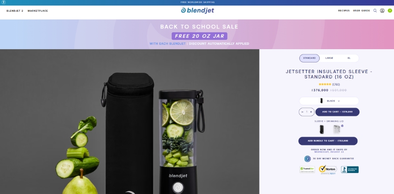
The website is colorful, which could be eye-catching for visitors. The product images on the site are distinctive, with backgrounds that match the color of the product, potentially highlighting the product’s features and design. The images are showcased with good lighting, and the color options for the products are automatically chosen and changed, which might facilitate ease of browsing.
19. Japanla.com
JapanLA is an online retail store known for offering cute and unique pop culture items from Japan, Korea, and beyond. The product pages are designed with simplicity in mind, utilizing a cute font that perfectly complements the store’s niche.
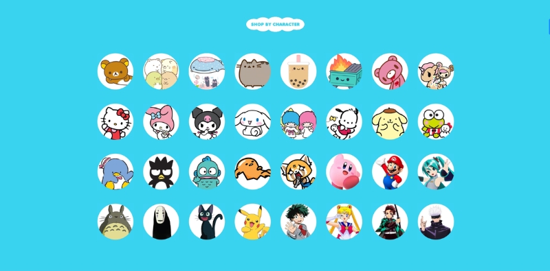
A standout feature of the product pages is the display of collections as images of famous anime characters. This creative approach not only highlights the pop culture nature of the items but also allows customers to easily identify products associated with their favorite characters.
20. sendafriend.co
SendAFriend is an online gift shop specializing in plush animal gifts for various occasions. The product pages on the site are notable for allowing customers to customize the message on the accompanying gift card freely. In addition, the inclusion of pre-written message ideas provides useful inspiration for those looking to express their sentiments more effectively.
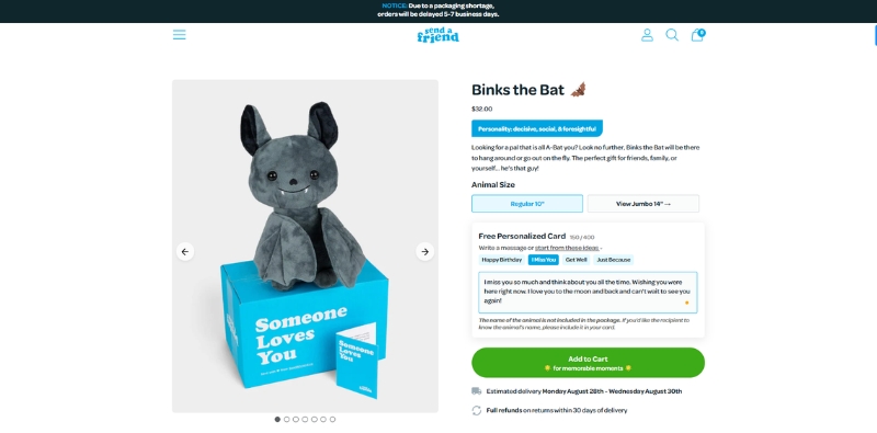
Another unique feature of the product pages is the brief description of the personalities of the plush characters. These descriptions can help customers decide if a particular item is the right fit for the intended recipient, adding a personalized and thoughtful touch to the gift-giving process.
Best Tips To Design Your Product Pages
Designing an effective product page is essential for any eCommerce business, as it can significantly impact conversion rates and sales. Here are some tips to help you design your product pages for maximum impact.
Crafting Compelling Product Descriptions
A great product description shares the wonderful features and benefits of your products with customers. Short, focused descriptions that highlight what makes your products unique are key.
You should tailor your descriptions to the wants and needs of your target audience. Also, you can showcase the value and perks of your products to make it easier for customers to choose you over the competition.
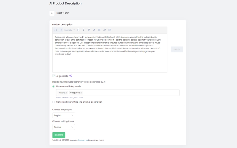
For those looking to streamline this process, Search Pie offers an innovative solution. This app uses AI technology to automatically generate engaging product descriptions with just a few clicks, eliminating the need for tedious manual writing.
Additionally, Search Pie provides the option to generate product descriptions in bulk, accommodating up to 10 products at a time. With these features, Search Pie offers a convenient and efficient way for e-commerce businesses to optimize their product pages.
Optimizing Product Images for Maximum Impact
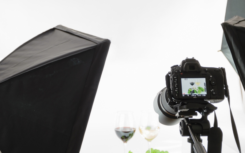
Pictures are worth a thousand words, especially when it comes to online shopping. Clear, high-quality images make a world of difference on your product pages. Make sure your photos are crisp, professional, and show off your products from various angles. Close-ups are great for highlighting special features and details.
Furthermore, you can consider arranging multiple images in a block format on your product page. This gives shoppers a well-rounded view of your product, helping them get a feel for what it really looks like.
Remember to keep your images lightweight for quick page loading. But don’t sacrifice image quality – a blurry or pixelated image can turn customers away. Bonus points for adding 360-degree views and zoom features; they make your product images even more helpful to shoppers.
Incorporating Customer Reviews and Testimonials
Customer reviews and testimonials are like gold for your product pages. They not only build trust but also show that people love your products. Positive words from past customers can give potential buyers the reassurance they need.
Also, don’t be shy about showing off a variety of ratings. And, make it easy for customers to share their thoughts and experiences. If they have photos or videos of your products in action, even better!
Showcasing these images from customer feedback can really bring your products to life and help future customers envision how they might use them. So, let your happy customers do the talking and watch how their words and images can boost your product pages.
Leveraging Video Content to Enhance Product Pages
Videos can really bring your product pages to life. They offer a dynamic way to show off your products, demonstrate how they work, or even give a quick tutorial. If a picture is worth a thousand words, then a video is worth a million.
Use videos to show off your products’ best features or to explain anything that might be a bit complex. It’s a great way to communicate the unique benefits of your products quickly and effectively.
Moreover, don’t forget to include videos from customer feedback if you have them. These can be super helpful for potential customers to see your products in real-life situations.
Choosing the Right Color Scheme and Typography
When it comes to your product pages, looks matter. You want a design that feels like your brand and is easy on the eyes. That means picking colors that not only match your brand but also go well together. Make sure there’s enough contrast so that everything is easy to read.
The fonts you use are important, too. Choose ones that are easy to read and fit your brand’s vibe. They should add to the overall look and feel of your product pages, not distract from it.
By keeping your colors and fonts consistent across your product pages, you’ll create a look that’s professional and inviting. It’s all about making your pages a place where customers enjoy spending time.
Creating Effective Call-to-Action (CTA) Buttons
Call-to-action buttons are like friendly nudges that help your customers know what to do next. Whether they’re adding an item to their cart, heading to checkout, or adding a free gift, a good CTA button makes it simple for them.
Make sure your CTA buttons pop on the page. Pick colors that stand out from the background and write clear, to-the-point text that tells your customers exactly what they should do.
Place your CTA buttons where they’re easy to find. You want it to be a breeze for customers to take the next step in their shopping journey. It’s all about making their experience smooth and enjoyable.
Product Page FAQs
1. How can I improve product page readability?
First, choose a legible font and use a consistent color scheme that aligns with your brand. Break up text with headings, bullet points, and whitespace to make the content easier to scan.
2. How should I handle out-of-stock items on the product page?
Clearly indicate when an item is out of stock. Offer customers the option to be notified when the item is back in stock or suggest alternative products they may be interested in.
3. How can I showcase product variations on the product page?
Use dropdown menus, color swatches, or image thumbnails to display product variations like size, color, or material. Make sure the price and product image are updated to reflect the selected variation.
4. How can I encourage customers to share product pages on social media?
Add social media sharing buttons to your product pages, preferably near the product image or description. You can also run promotions or contests that encourage customers to share your products on their social channels.
5. How can I improve my product pages for mobile devices?
Consider implementing Accelerated Mobile Pages (AMP) features from SearchPie. This allows you to tailor your site’s appearance on mobile devices while ensuring quick loading times.
Wrap Up

In conclusion, crafting a compelling and attractive product page is a multifaceted process that requires careful attention to detail. From crafting compelling product descriptions and optimizing product images to incorporating customer reviews and leveraging video content, every element plays a crucial role in creating an engaging and effective product page.
As we’ve explored in this blog post, utilizing these best tips and design ideas can make a significant difference in how your product pages perform. With the right strategies and design choices, your product pages can become a powerful tool for attracting customers and driving sales in 2023 and beyond.