Website Navigation: Best Practices, Examples, and Tools 2023
Website navigation isn’t just a list of links; it’s a crucial element that impacts user experience and engagement. From best practices to useful tools and real-world examples, we’re excited to share insights that can help you optimize your site’s navigation. So, without further ado, let’s explore how you can enhance your website’s usability and guide your visitors more effectively.
What Is Website Navigation?
Website navigation is like the friendly tour guide of a website. It’s a handy system that helps users effortlessly browse through various sections or pages. Just like a skilled guide makes your tour memorable, effective website navigation ensures visitors find what they need swiftly and easily.
This not only keeps users around longer but also contributes to the site’s overall success. A skillfully crafted user interface has the potential to boost your website’s conversion rate by as much as 200%.
On the flip side, confusing navigation can leave users frustrated and more likely to exit. 76% of consumers indicate that the most crucial aspect of a website’s design is its ability to make it simple for them to locate what they’re looking for.
Navigation Structure
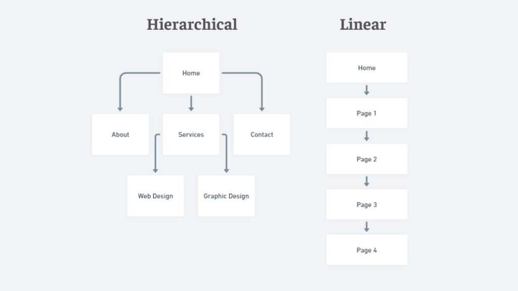
Think of the navigation structure as the architecture of a building. It’s the framework that lays out how all the navigational elements are organized and connected. The aim is to make the website navigation design as intuitive as a friendly handshake—users should easily predict where to find what they’re looking for. Here’s a quick tour of the common types:
- Hierarchical Structure: This is a common way to set up many websites. Imagine a pyramid where the homepage is at the top, and the main sections break down into smaller parts below it.
- Linear Structure: Think of this as a guided tour. Users move from one page to another in a set sequence—ideal for specific tasks like tutorials or surveys.
- Matrix Structure: This is your “choose your own adventure” style, letting users navigate freely through interconnected pages. It’s versatile but needs to be handled with care to avoid confusion.
Website Navigation Menu
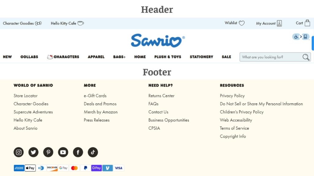
The website navigation menu is the “Welcome” sign of your website—usually front and center at the top or gracefully positioned along the side. It provides shortcuts to the most important destinations on your site. Sometimes, it even has nested submenus to dive deeper into specific topics. You might also find a footer menu at the bottom for extra navigational help.
An effective website navigation menu is a bit like a well-designed sign—easy to read, and possibly adorned with visual cues or icons to make your journey smoother.
What Are Types Of Website Navigation?
Navigating a website should feel as effortless as flipping through the pages of your favorite book. But what makes this possible? There are multiple types of website navigation styles, each with its unique advantages and best-use scenarios.
Horizontal Navigation
Horizontal navigation guides you through key areas via a menu that runs from left to right, usually at the top of the page. Let’s explore two popular types:
Top Bar Navigation
Imagine walking into a library and seeing all the sections neatly labeled right at the entrance—that’s top-bar navigation for you. This website navigation menu sits at the top of the webpage and is one of the most traditional and straightforward ways to help users find what they need quickly.
Sticky Navigation
This is the friendly guide that sticks by your side, or rather, the top of your screen as you scroll. A sticky website navigation menu ensures that users always have access to key areas of the site without having to scroll back to the top.
Vertical Navigation
Unlike a horizontal navigation menu that goes across the top, a vertical navigation menu runs up and down the side of a webpage. Here are two types:
Sidebar Navigation
Think of this as the table of contents that you can always see as you skim through a book. Typically situated on the left or right side of the web page, sidebar navigation allows for easy access to various site sections.
Floating Sidebars
Like a helpful shadow, floating sidebars move with you as you scroll down the page. They offer the same advantages as sidebar navigation but are especially handy on long-scrolling pages.
Drop-Down Menus
Drop-down menus are a versatile navigation element that allows users to access multiple options, sub-menus, or features from a single clickable interface, simplifying the user experience while efficiently organizing content.
Simple Drop-Downs
Hover over or click on a menu item and—voila!—a list drops down. Simple drop-downs offer a clean and quick way to navigate to sub-sections without cluttering the main menu.
Multi-Level Drop-Downs
Think of these as drop-downs within drop-downs. They allow for even deeper navigation into subsections, making them useful for sites with extensive content.
Mega Menus
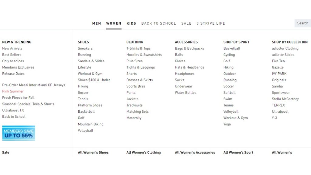
This is the buffet of navigation options. When clicked or hovered over, a large panel of choices appears, often categorized and sometimes even accompanied by images or icons. Ideal for sites with a broad range of offerings.
Footer Navigation
Sometimes, important links are tucked away at the bottom of the page in what’s known as footer navigation. It’s a good secondary navigation area for resources, FAQs, contact information, and more.
Breadcrumb Navigation
You’re never lost with breadcrumb navigation, as it shows you the path you’ve taken from the home page to your current location. Like Hansel and Gretel’s trail of breadcrumbs, it helps you backtrack effortlessly.
Tabbed Navigation
This layout employs tabs, much like those in a binder, to categorize content. Users can easily switch between different sections without leaving the current page.
Mobile Navigation
Navigating through mobile applications and websites has become increasingly streamlined thanks to intuitive design elements like hamburger menus and bottom navigation bars.
Hamburger Menus
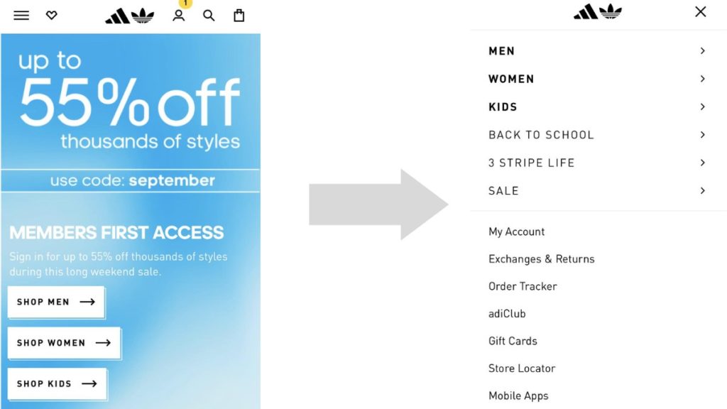
The three-line icon that transforms into a full menu upon interaction is known as a hamburger menu. It’s a mobile-friendly way to condense a lot of information into a small space.
Bottom Navigation Bars
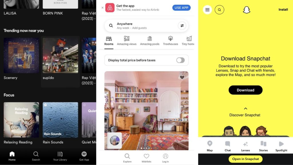
Source: Spotify, Airbnb, Snapchat
Often seen in mobile apps, these are navigation options located at the bottom of the screen for easy thumb access.
Contextual Navigation
Contextual navigation is a user-centric approach that enhances content engagement by providing seamless pathways to relevant information through elements like in-content links and related articles.
In-Content Links
As you’re reading through content, you might encounter a clickable text that takes you to relevant sections or even different websites. This type of navigation enriches your reading experience by providing more context or information.
Related Articles
Usually found at the end or side of an article, these links guide you to additional content that is similar or relevant to what you’re currently viewing.
Understanding these various types of navigation can help both designers and users better appreciate the structure and accessibility of a website. Each type serves a purpose, and combining them thoughtfully can result in a seamless, user-friendly experience. Happy browsing!
10 Website Navigation Best Practices
Navigating your website should feel like a breeze, as natural as flipping through your favorite magazine. No headaches, no fuss, just a smooth ride from point A to point B. Here are some website navigation best practices to make sure your website’s menu and buttons are easy to use:
1. Keep Things Simple and Consistent
The key to a great website is making it easy to use. Your menus should be simple to understand, with no confusing words. And it’s really important to make sure that the whole website has the same look and feel.
When everything is consistent, people feel more comfortable and find it easier to navigate. So let’s keep things simple and consistent, making it a win-win for everyone!
2. Put First Things First
You’ve got to show off what’s most important right from the get-go. Whether you’re offering amazing services or selling top-notch products, make sure these are the first things people see when they visit your site. You want these main attractions to grab everyone’s attention.
To help people find their way, you could use visual helpers like arrows or cool little pictures (we call them icons) that point out these key areas. That way, visitors will easily see what’s most important and are more likely to check it out. So, put the big stuff front and center and make it super easy for people to find what they’re looking for!
3. Less Is More in Menus
Too many choices can lead to decision fatigue. This is supported by Miller’s Law, a psychological concept that posits the average person can only retain around 7 items, give or take 2, in their short-term memory at any given moment.
So, let’s cap it at about seven items in your main menu to keep things easy-breezy. Oh, and try to stick to one-level dropdowns if you can. No one likes getting lost in sub-sub-menus.
4. Don’t Hide the Search Bar

If you’ve got a lot going on, a search bar is your go-to tool. A study by Forrester Research found that about 43% of people who visit a website go straight to the search box. These folks are two to three times more likely to actually do something on the site, like buy a product, compared to those who don’t use the search box.
Thus, one of the website navigation best practices is to make the search bar easy to spot, right up top, so people can jump to their desired destination in no time.
5. Show Where You Are
It’s really helpful to know where you are on a website, just like it’s useful to see a “You Are Here” sign in a mall. By changing the color of the link you’re on, or adding breadcrumbs at the top of the page, you can make it clear to visitors where they are. This makes it way easier for people to find their way around your website, and they’re less likely to get lost or confused.
6. Think Mobile-Friendly
Let’s not forget our friends browsing on phones and tablets. This is because more than 50% of people say they won’t think about buying from a brand if its mobile website is bad.
Your website should look and feel just as awesome on smaller screens. QR codes on printed materials can also whisk people straight to your website without any typing fuss.
7. Say No to Dead Ends
We all hate getting stuck, especially when we’re exploring a website. That’s why it’s super important to always give visitors a next step to take. Maybe it’s a great article you think they’ll enjoy reading next, a product you’re selling that they might be interested in, or just a simple button that takes them back to the homepage.
Whatever it is, make sure they have somewhere to go. This keeps people engaged and makes them more likely to stick around your site for longer, which is a win-win for everyone!
8. Keyboard-Friendly is Friend-Friendly
Some people like to use a keyboard to get around a website, and for others, it’s a must. Making your website work well with keyboard shortcuts isn’t just a nice feature—it’s crucial for inclusivity.
By letting users tab through clickable items or use keyboard commands, you’re making your site more accessible and user-friendly for everyone.
9. Add a “Back to Top” Shortcut
Long pages full of information are useful, but scrolling back to the top can be tiring. A “Back to Top” button is a simple yet effective way to save your visitors some thumb energy. This convenient shortcut lets people jump back to the start of the page without endless scrolling, making their experience on your site more enjoyable.
10. Sticky Filters for the Win
Got an online store or a long list of products? Make sure the filters stick to the screen when people scroll down. This way, they can easily change the settings to find exactly what they’re looking for without having to scroll back up.
With these tips, your website won’t just be a place to land on—it’ll be a place where visitors love to stay and explore.
Creative Website Navigation Examples
Stepping outside the box with website navigation design can make all the difference in capturing attention and leaving a lasting impression. From fun games to interactive stories, some creative folks are shaking up the usual “click and scroll” with truly unique navigation ideas. If you’re ready for some inspiration, check out these standout examples that take your website navigation design to the next level.
Behance
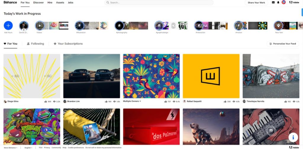
Behance uses an intelligent recommendation engine to curate a list of creative projects tailored to your interests. As soon as you interact with the platform, Behance will recommend creative work you’ll love, from graphic design to photography and more. When you land on the homepage, you’re greeted by a grid of projects that both showcase a variety of art forms and are influenced by your past interactions.
Furthermore, this layout employs visually striking thumbnail images for each project, aiming to instantly capture the viewer’s attention. The site’s navigation is highly visual and designed for easy discovery and appreciation of creative work. Whether you’re an artist seeking to display your projects or an enthusiast looking to explore, Behance offers a dynamic and visually stimulating platform to meet your artistic needs.
Duolingo
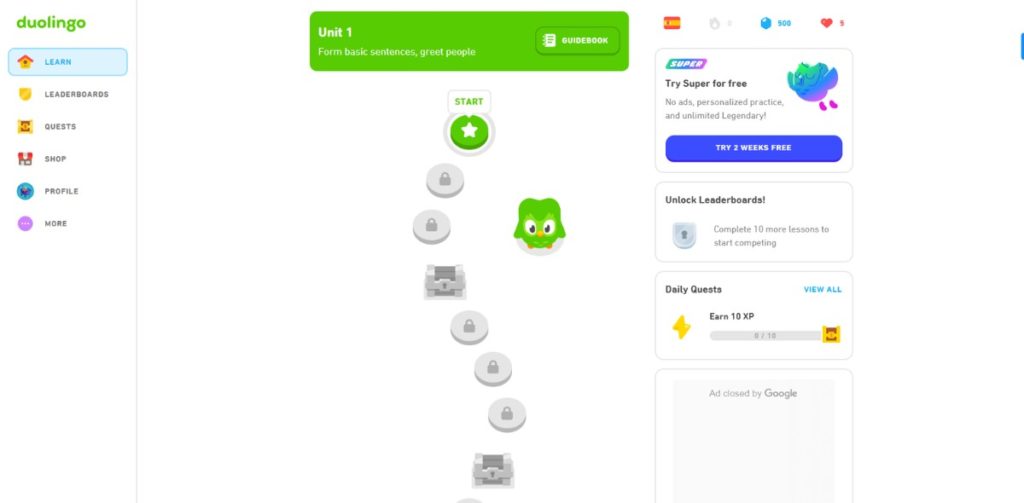
Duolingo features a game-like interface that turns language learning into an engaging experience. When you first land on the platform, you’re guided through a smooth onboarding process that helps you choose a language and set your learning goals. With its bright colors, friendly mascot, and playful icons, the platform immediately establishes a casual, approachable atmosphere.
This website navigation design aims to offer clear paths for learning, segmented into modules that focus on various language skills like speaking, reading, and grammar. Each module features a series of short lessons and quizzes, represented by visually appealing icons, making it easy for users to identify their next steps.
Rally Interactive
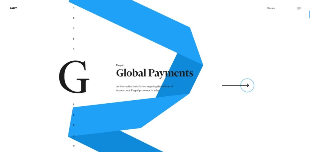
Rally Interactive is a digital design studio that takes an unconventional approach to website navigation by emphasizing its case studies through a scroll-based system.
Upon landing on the website, users are immediately introduced to the studio’s portfolio. But what truly differentiates this website navigation experience is the “A to Z” side navigation feature. This offers a quick, alphabetical way to sift through Rally Interactive’s various projects, bypassing the need for endless scrolling. Each letter correlates with a project, providing an intuitive, rapid access pathway to the desired content.
Bruno Simon
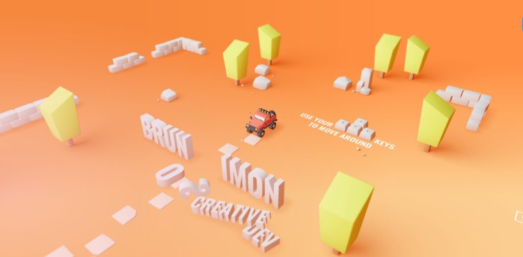
Using a driving game as a navigation system, as seen in Bruno Simon’s portfolio site, is a groundbreaking approach that immediately distinguishes the site from other website navigation examples. This unique design does more than just engage; it serves as an extension of the portfolio itself, showcasing the developer’s creativity, technical skill, and proficiency in UI/UX.
The game-like navigation encourages users to interact more deeply with the site, potentially increasing user engagement and time spent exploring the portfolio. It’s a brilliant way to create a memorable experience for visitors, making them more likely to remember the site and, by extension, the developer’s work.
However, it’s essential to consider the potential downsides. Such an innovative interface might pose accessibility challenges for some users, like those with disabilities or those unfamiliar with game-like interactions. Performance could also be an issue, as a game is generally more resource-intensive than standard navigation elements.
Necessary Tools To Optimize Website Navigation
When it comes to optimizing website navigation, there’s no one-size-fits-all solution. However, there are several tools that can assist you in this process, each with its unique set of features that can help improve user experience. Let’s dive into some of these essential tools:
Google Analytics 4
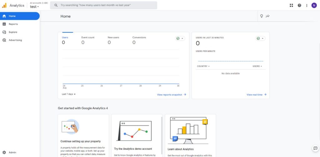
What it Does
Google Analytics 4 (GA4) is the latest iteration of Google’s renowned analytics tool. It offers a more user-centric model, with improved machine learning algorithms to help you better understand your audience.
How it Helps in Navigation Optimization
GA4 places an emphasis on tracking events and user journeys, making it particularly useful for optimizing website navigation. Unlike its predecessor, GA4 allows you to track users across multiple devices and platforms, providing a more complete picture of the user journey.
User Flow: GA4 offers an enhanced ‘User Explorer’ where you can examine the paths users take through your site. This helps identify where people typically enter and exit, as well as where they may be dropping off, providing insights on areas that need improvement.
Event Tracking: GA4 allows for more flexible event tracking, which means you can easily track interactions like button clicks, form submissions, and other actions that are crucial to understanding how users navigate your site.
Hotjar
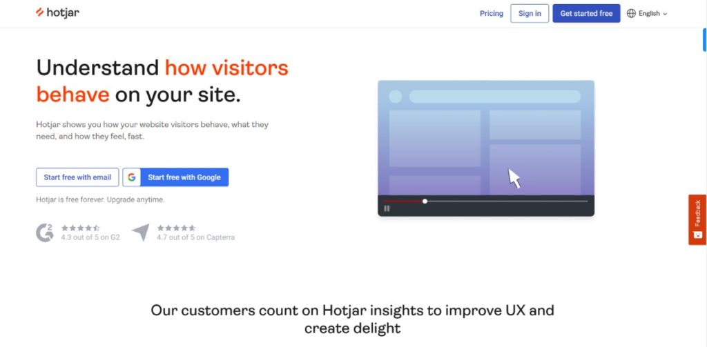
What it Does
Hotjar is a behavior analytics tool that offers heatmaps, session recordings, and surveys to better understand your users.
How it Helps in Navigation Optimization
Hotjar’s heatmaps can visually represent where users click, move, and scroll on a page. This data can reveal whether users are finding what they need or clicking in areas that lead to dead-ends. The session recordings can show you real user journeys, helping you identify any difficulties or barriers they encounter while navigating.
Treejack
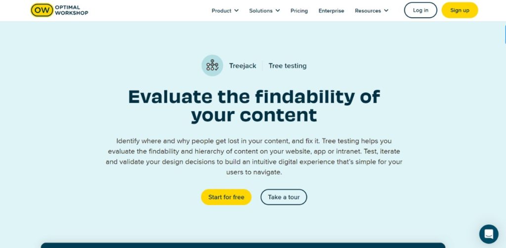
What it Does
Treejack specializes in information architecture. It allows you to test your site structure without visual design elements influencing user decisions.
How it Helps in Navigation Optimization
With Treejack, you can perform ‘tree testing,’ where users are asked to complete tasks based on your site’s structure. This helps you understand if your content is organized in a way that makes sense to your target audience. If users struggle to find what they’re looking for, you can pinpoint exactly where your navigation is falling short and make targeted adjustments.
Optimizely
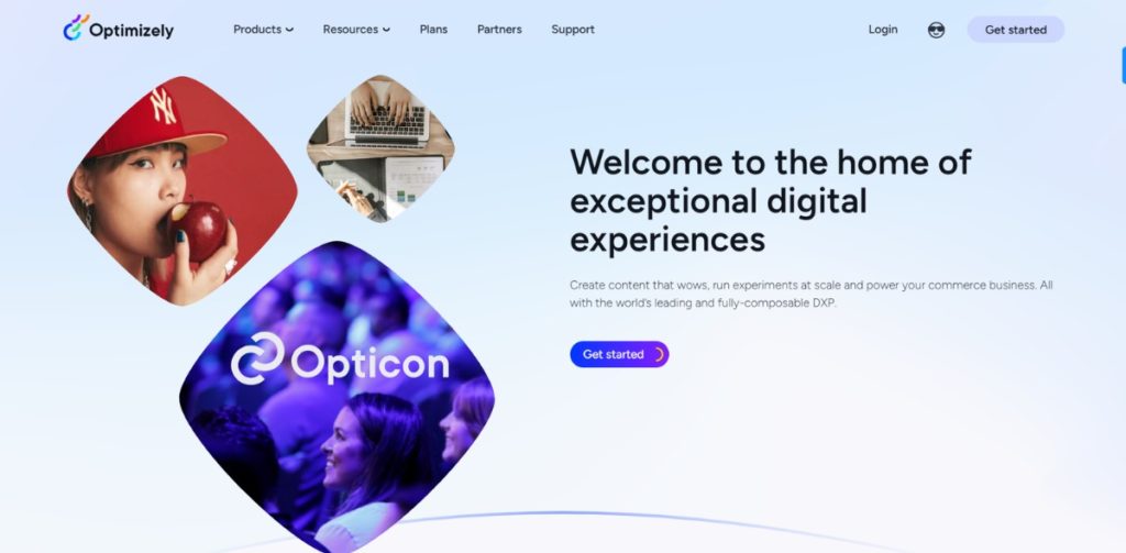
What it Does
Optimizely is a platform for website optimization that offers A/B testing, multivariate testing, and personalized user experiences.
How it Helps in Navigation Optimization
Through A/B testing, you can experiment with different navigation elements to determine which version performs better in terms of user engagement, click-through rates, and conversions. For example, you could test different menu layouts, button placements, or CTA text to find the most effective setup.
Optimizing your website’s navigation is an ongoing process. However, leveraging these tools can provide the insights you need to make informed decisions. By continuously monitoring, testing, and adapting, you can create a navigation structure that not only meets the needs of your users but also drives business success.
Wrap Up
We’ve journeyed through the essentials of website navigation for 2023, from best practices and innovative examples to key tools like Google Analytics 4 and Hotjar. The takeaway? Effective navigation is a cornerstone for a stellar user experience and better conversions.
Thanks for joining us on this exploratory blog post. We hope it leaves you better equipped to guide your visitors towards a fulfilling online experience.
>>> Read more:
Product Page: 20+ Attractive Designs With Best Tips (2023)
Product Reviews: Tips And Tricks To Boost Your Shopify Store